Spark 2.o design system
THE GOALROLETEAM MEMBERSReimagine a legacy design system into a modern, scalable, and AI-first design system.
Product design lead/product manager
3 frontend developers
Why did we do this?
Recharge grew up quickly. As one of its early designers, I witnessed this growth firsthand.
As Recharge evolved, the product had begun to drift. New features were added quickly, visual patterns diverged, and the experience no longer reflected our refreshed brand. More importantly, the application had become increasingly difficult to extend consistently.
Rather than applying another layer of polish, we stepped back and asked a bigger question:
How could we create a foundation that would make every future feature easier to build, easier to use, and easier to maintain?
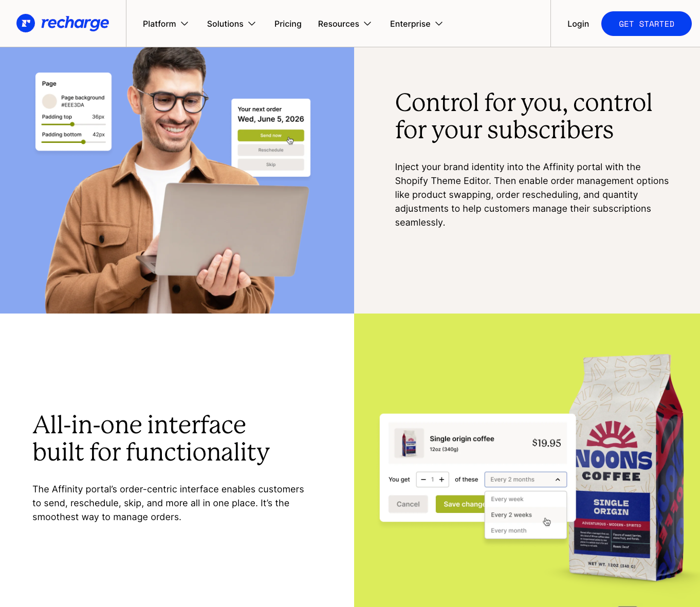
New marketing websiteHow might we evolve Spark into a design system that feels modern today while remaining flexible enough to support tomorrow's features?
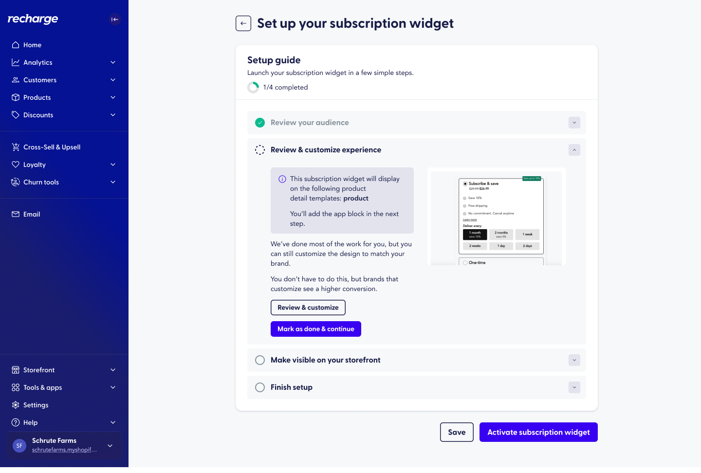
Old styles
Building Spark 2.0
Spark 2.0 introduced more than a refreshed interface. It established a cohesive system of reusable patterns, shared components, and interaction principles that could scale as the product evolved.
Rather than redesigning individual screens, we focused on creating a framework that would make future product work faster, more consistent, and easier to maintain.
We built with a few goals: simplicity, delight, and future-proofing.
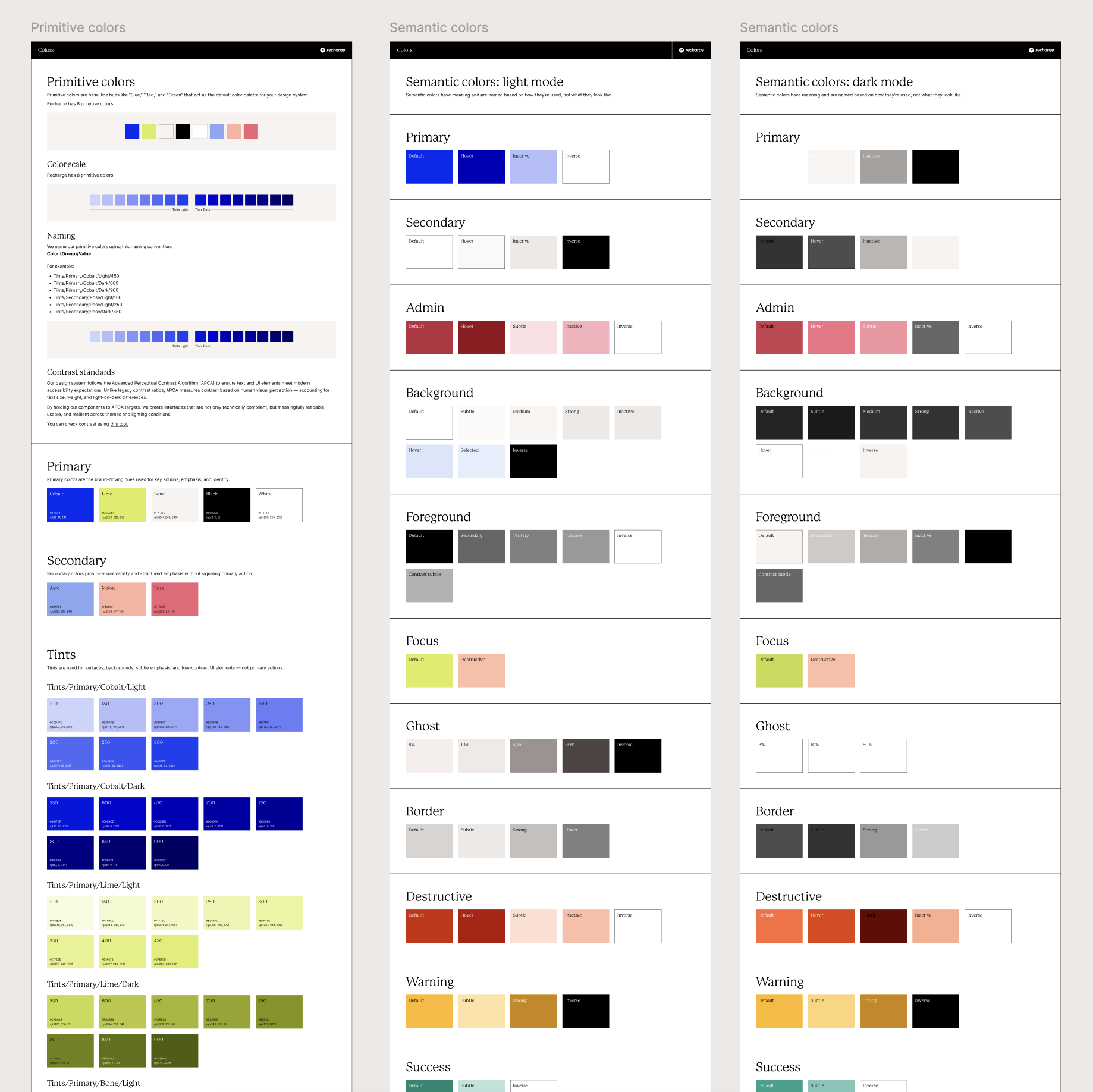
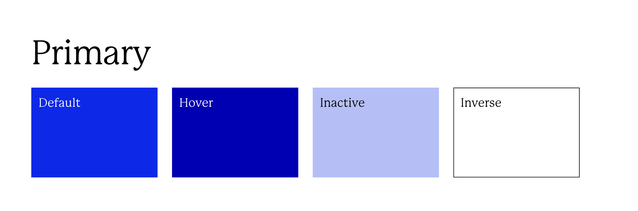
Built for simplicity—semantic colors
The previous design system relied on an inconsistent collection of colors that made hierarchy difficult to establish and left implementation up to interpretation.
We simplified the palette into a smaller set of intentional semantic colors. This improved accessibility, strengthened visual hierarchy, and gave engineering a predictable system that could be reused throughout the application.
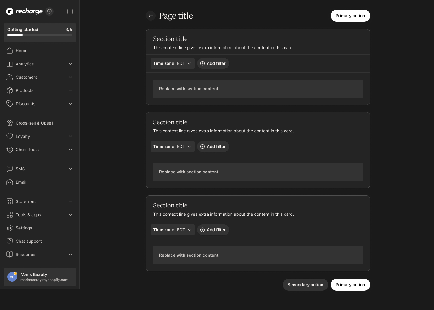
Built for delight—light & dark modes
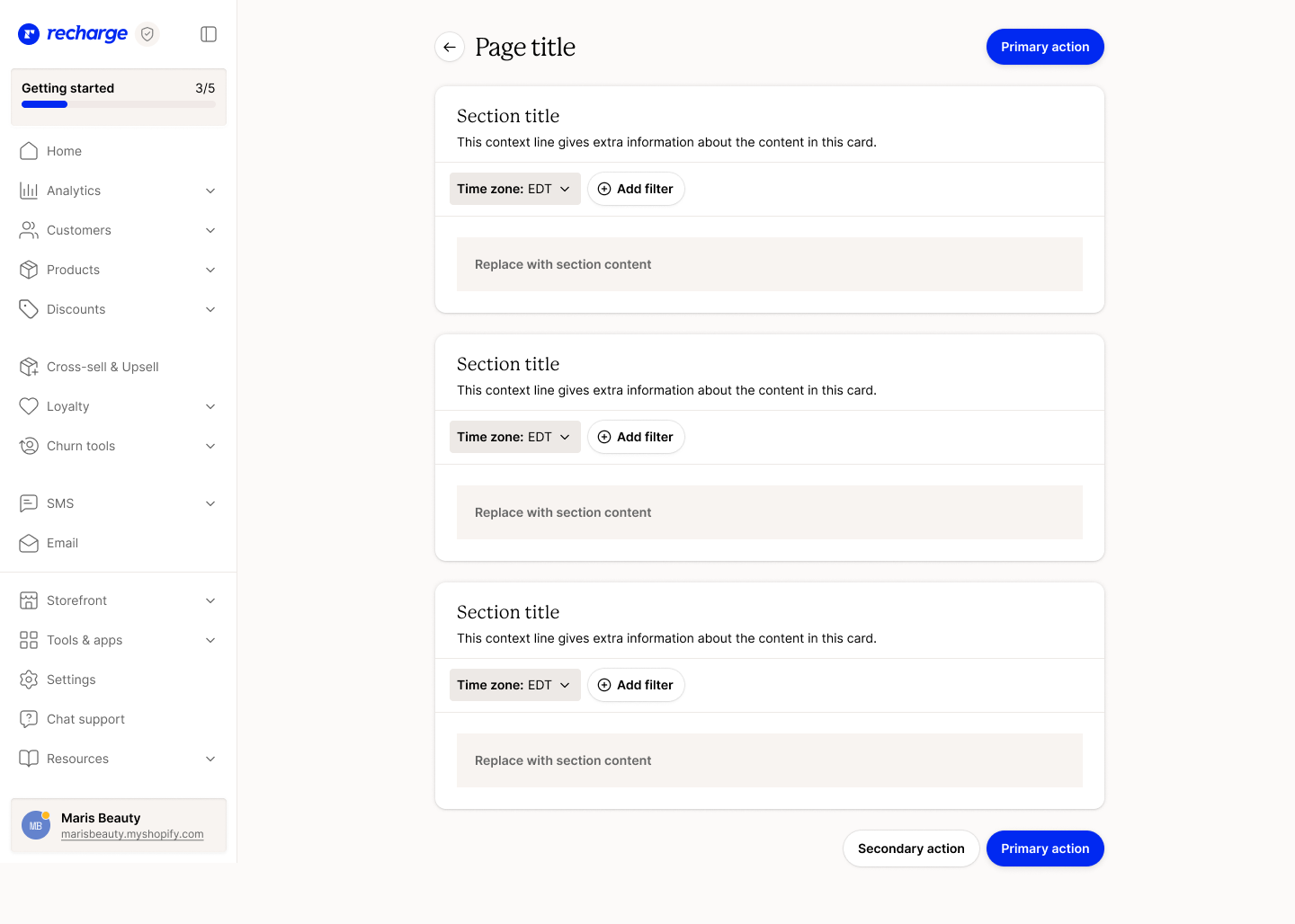
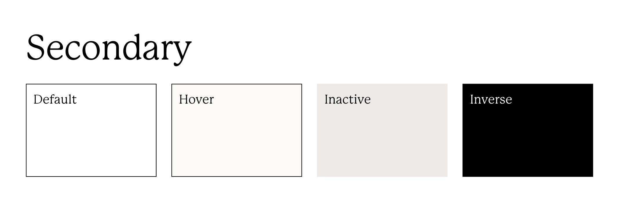
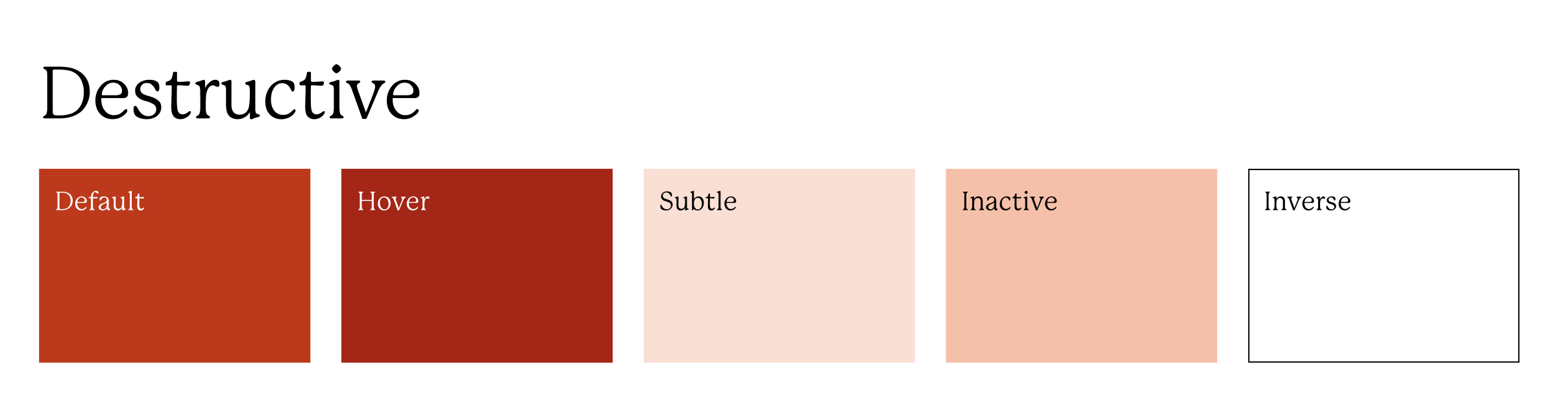
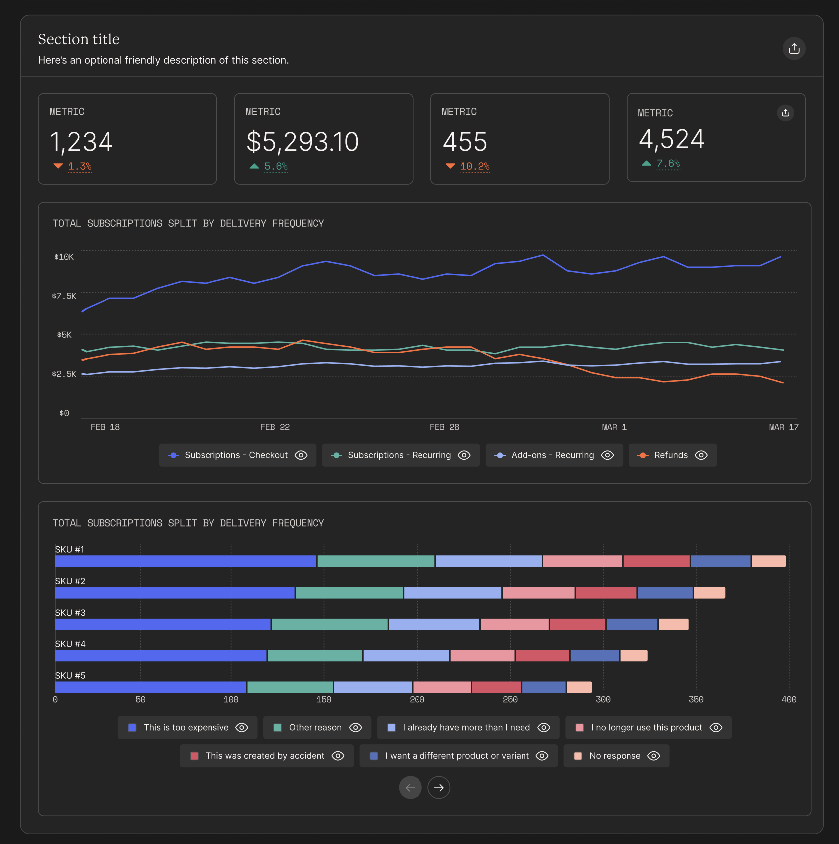
Along with the brand refresh came the opportunity to offer “delight” to our merchants and internal users. Instead of set-in-stone colors for Recharge, we built both light and dark modes to appeal to different preferences. Building both themes simultaneously forced us to create more resilient color tokens and component behaviors, resulting in a design system that was easier to scale and maintain.
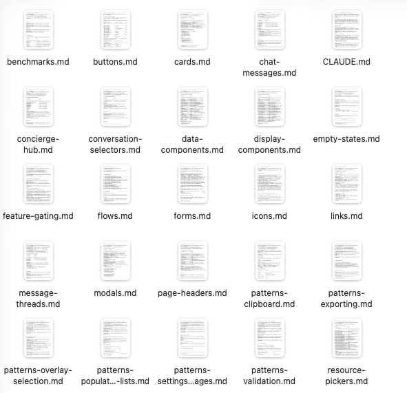
Built for the future—AI-friendly documentation
As AI capabilities became an increasingly important part of the product roadmap, we wanted Spark 2.0 to provide a flexible foundation for future design and development.
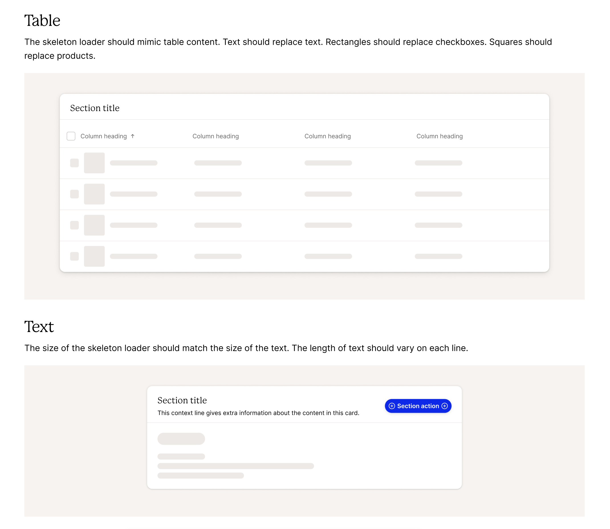
In close collaboration with frontend, we made sure Spark 2.0 was built for AI to read. Frontend built a Spark MCP that is used every time someone generates a UI in our app. The MCP gives the LLM more context to make better design decisions. On the design side, we wrote robust documentation for all of our components and used that documentation to create skills files that live alongside components.
Step 2: Prioritize components
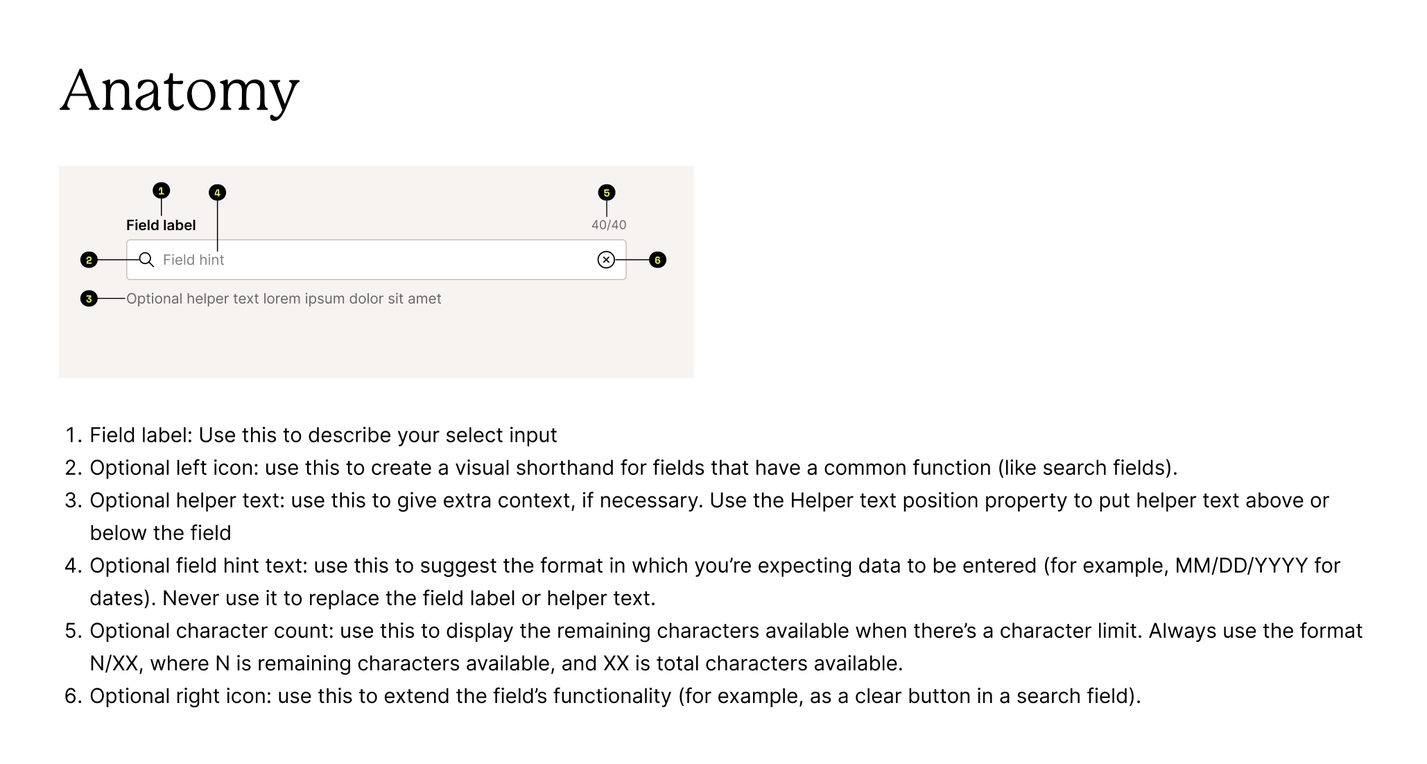
I identified the patterns that would have the biggest impact on the look & feel of our app and put them in priority order, knowing we would likely complete this project in phases. This helped me have opinions going into technical conversations.
Step 3: Break into actionable milestones
Since surgically replacing components and one-off implementations would be quite the undertaking, we decided milestone #1 would simply be a 1:1 mapping of existing tokens, typography, and styles to new ones. This would get us a new look & feel without investing too much time. Milestone 2 would be actually building out the new components in Storybook and then replacing them in app, without anyone noticing. :)
Step 4: Execute (with design & dev in lockstep)
With no project manager for this initiative, design & frontend were the driving forces of Spark 2.0. We collaborated side-by-side along the way with many async reviews. Collaboration looked a lot like the screenshots below, with frontend tagging me when a component was ready to review. It was quick and collaborative, with give and take on both sides. Whenever changes were made, I’d make sure Figma was aligned with Storybook and vice versa.
Until Spark 2.0, design and engineering didn’t have a robust single source of truth. Now, we have a comprehensive Storybook built directly from Figma designs, with design reviews of every single component.
Turning strategy into reality
A redesign of this scale couldn't happen all at once. Rather than attempting a large-scale rewrite, I partnered closely with engineering to create an implementation plan that balanced merchant value with technical feasibility.
Together we prioritized foundational components and broke the work into incremental milestones that could be delivered alongside ongoing product development.
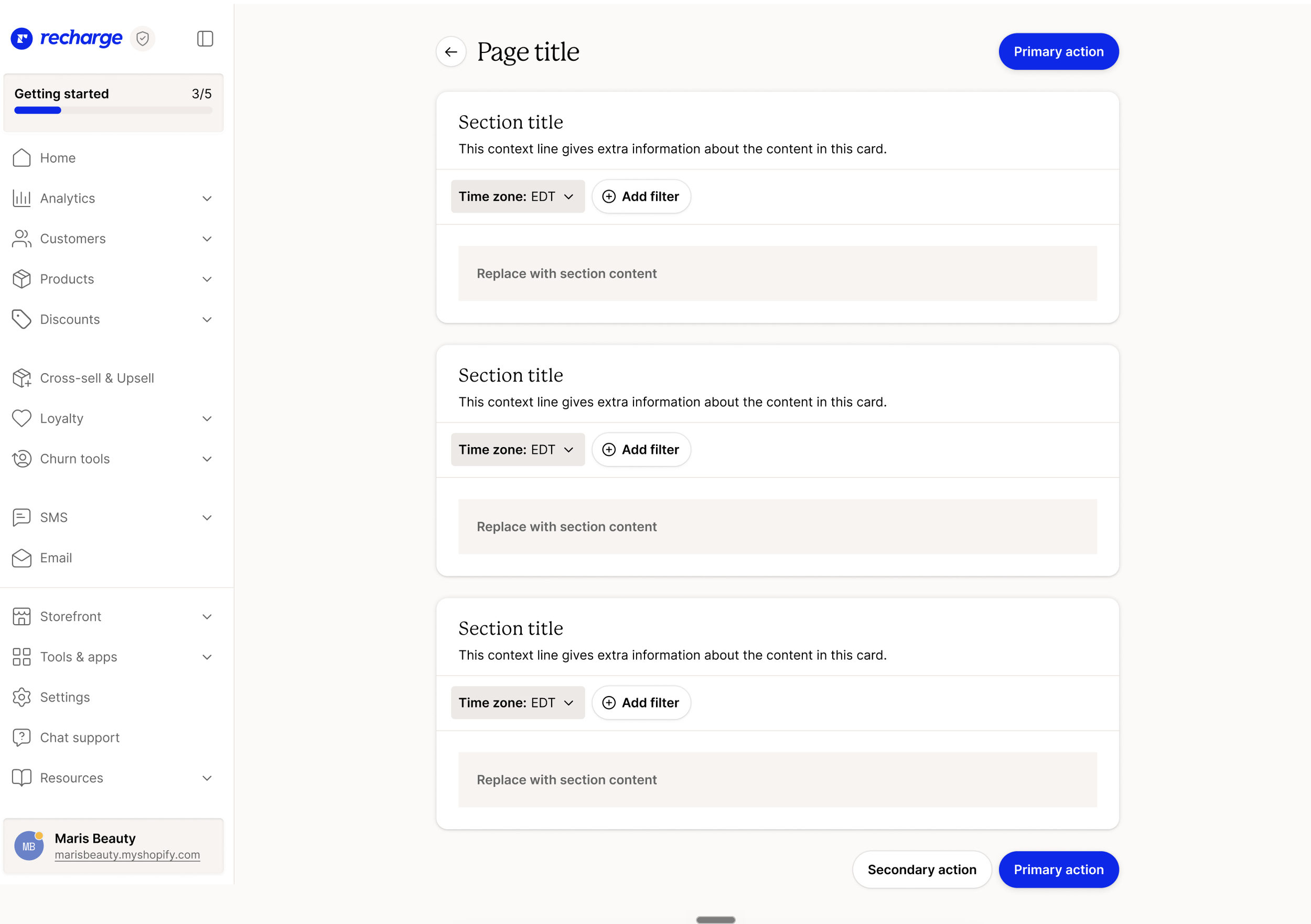
Step 1: Mock up core page types
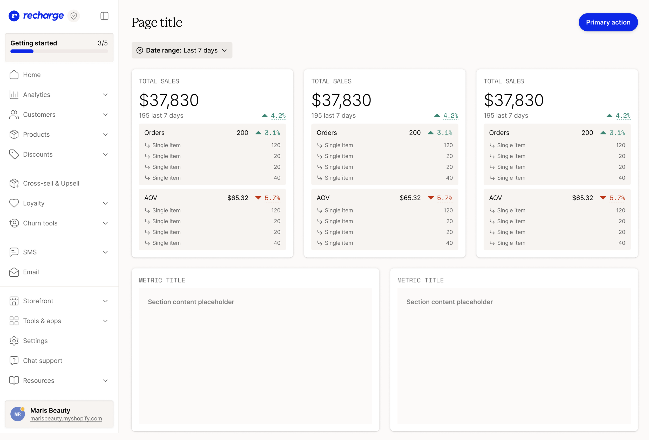
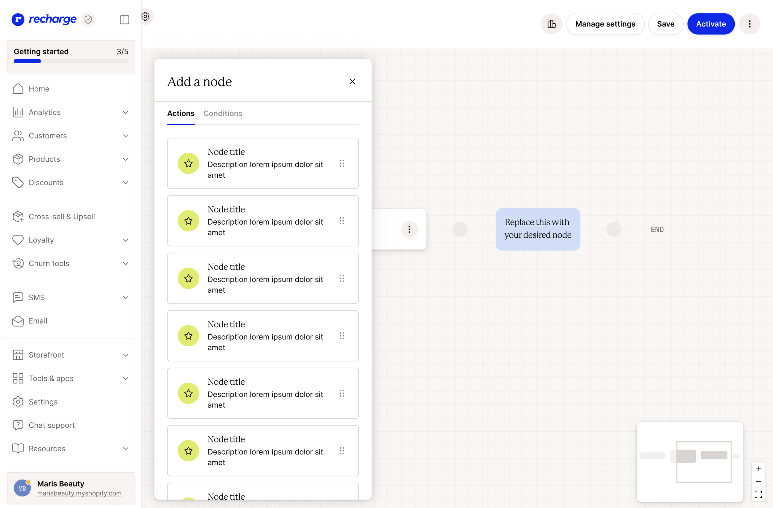
I wanted to know what the whole system would look like and have page-level references for the dev team, so I mocked up recurring page types in our app. Seeing everything holistically helped determine components that were the highest priority.
Results & reflections
Spark 2.0 established a shared foundation for the future of Recharge.
The new design system created greater consistency across the application, streamlined collaboration between design and engineering, and positioned the product to support future initiatives, including AI-powered experiences.
One of the biggest lessons from Spark 2.0 was that successful redesigns aren't primarily about creating better interfaces, they're about reducing friction across an organization.
Honestly, this project was just FUN. It was a few nerds collaborating on the nitty gritty details that seem small but make all the difference. I love collaborating closely with my frontend engineers and would do this project all over again in a heartbeart.