Role: Lead Product Designer
TLDR
Led the research and design efforts for the transition from a single product offering to a multi-product platform.
Collaborated closely with the head of product, product managers, software engineers, the legal department, the billing department, and more to bring this high-level and high-priority project over the finish line.
What’s the background here?
Since its inception, subscriptions have been Recharge’s bread and butter. However, in recent years Recharge has been expanding beyond the subscription realm into a broader e-commerce space. Loyalty, memberships, bundles, workflows, and more are just a few examples of how the business has been expanding.
What was the problem?
With rapid growth came a tool bursting at the seams with new features and products but no good organizational structure. With Recharge scaling its offering, it became a challenge for the entire company to not only better organize our product but to strategically price new features, work with various plan levels and permissions structures, and set ourselves up to go from a single subscription product to a multi-product e-commerce solution.
The research
Before diving into a major overhaul, our team started with a lot of research. First, we dug into lots of software, trying to find examples of multiple products within an app. Specific items we looked for were:
Pricing structures
In-app upgrade/downgrade paths
Permissions (who can and can’t upgrade/downgrade and what language is used when permissions are blocked)
Free trial structures (how they’re surfaced, what happens when they end, how they work with multiple trials at once)
Billing settings pages (what they’re called and where they’re located)
Here’s just a snippet of the solutions we looked at. You can see sticky notes littered throughout the screenshots, noting various aspects that stood out.
What’s research without a good summary?
All of my research was compiled into a presentation to highlight key findings supported with many screenshots so that research could clearly be communicated to the team and stakeholders throughout the entire company.
Initial sketches
After observing many repetitive and solid patterns, we wanted to envision how a flow like this could work for Recharge. I’m someone who believes in getting ideas out there for feedback quickly, so I threw some quick flows into a FigJam file. I focused on a few things:
An entirely new billing settings page
Paths to upgrade/downgrade from the billing settings page
Paths to add “add-ons” to an existing plan
Paths to upgrade or add on from various feature pages
Email communications to merchants with major plan changes
How the pages would change based on store type, existing plan type, and free trial
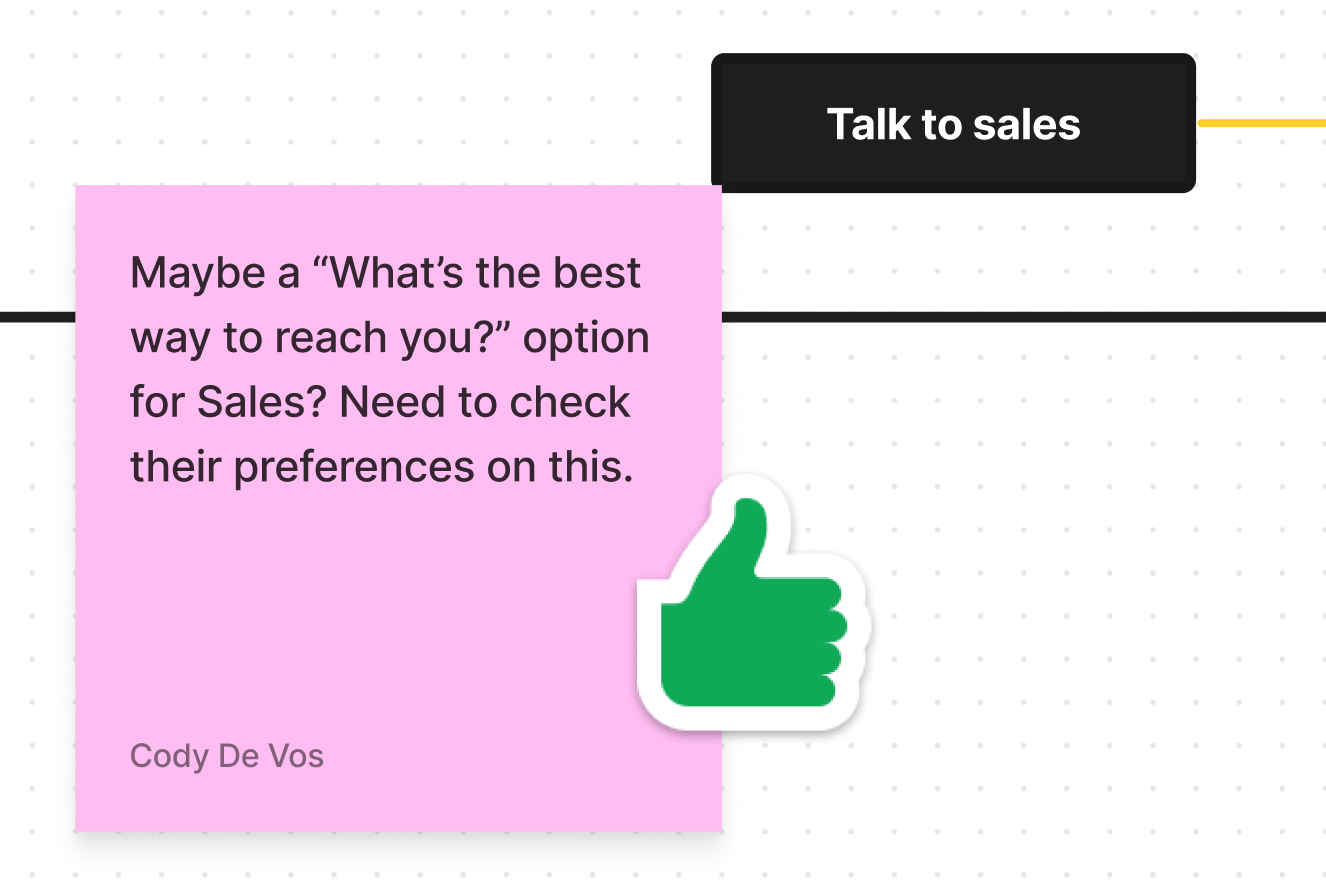
This got the ideas flowing and the conversation started. I initially reviewed with the Product Manager and Product Owner, and we left sticky notes and comments for one another in the file.
Once we felt strongly about the direction we were headed in, we showed the research and flows to our Director of Product and Director of Shopper Experience which gave us the green light to move forward with the next level of fidelity.
The designs—big picture & near term
As a part of the design process, we wanted to really envision what we could do with zero restraints and also design an actionable and easy path forward in the interim.
Some of the future term explorations that were explored were:
Fully self-service in-app upgrades/downgrades
Bringing marketing styles into key pages and areas (such as the plans page and add-ons)
A cart builder, allowing merchants to fully customize their plan
As much as we loved the future-term vision, when working in a startup environment, sometimes it’s just not practical to start there. But we aligned around where we could go while pivoting to where we should go for a practical, timely, and user-friendly rollout. A few things that we dialed back for the near-term vision were:
Upgrades/downgrades are not completely self-service. Many paths will still require assistance from sales in the interim.
Eliminated a page dedicated entirely to plans and pivoted to lightweight modals
Did not pursue the cart builder idea
Stayed with app styles for now for a lighter-weight solution
And for the MVP, we made it even more simple and didn’t allow plan changes at all. We only allowed add-ons and removal of add-ons.
Stakeholders upon stakeholders
This project touched SO many areas of our app. Product, engineering, product marketing, billing, customer success, finance, legal, marketing, and the list goes on. That means we had to have lots of conversations and feedback sessions throughout the company to make sure everything we were communicating to merchants was clear and accurate. We made many slight adjustments and improvements along the way and balanced the needs and desires of many stakeholders.
What’s next?
We’re currently in the process of rolling this out throughout the app. We’re gathering data to see how many merchants start and complete these flows. As we see the data roll in and talk with our merchants, we’ll continue to iterate and likely move beyond these MVP flows into some of the more self-service designs.
If you’d like to click through the flow a bit, you can dive into this file. This was one of the earlier iterations, but you can get a sense for how the flow feels.


